Bootstrap Grid System with Sitecore 9 Dynamic Placeholders
Before Sitecore 9 Dynamic Placeholders were only available with some custom code: the community had produced different implementations for that, such as the Integrated Dynamic Placeholders from Mark Servais and Jamie Stump. One of the new cool features of Sitecore 9 are the OOTB Dynamic Placeholders, with some great features we can easily imagine great implementations to our content editors.
This article shows a possible approach to implement a Bootstrap-Compatible Grid System taking advantage of the new features of Dynamic Placeholders to build a simple yet flexible Grid System. With that, you will be able to create complex page layouts in Experience Editor. Only a couple Views (cshtml files) were enough for this implementation, and I am pretty sure you can end up with a single view if you want. So, let’s get started!
Bootstrap Grid System
A quick look at the Bootstrap Grids markup shows its very simple:
<div class="container">
  <div class="row">
    <div class="col"></div>
  </div>
</div>
- “container” is the main wrapping div, where multiple rows and columns can be put inside
- “row” represents a grid row, taking the whole width of the “container”
- “col” is a column inside that row
Of course, if you want multiple columns and rows you will need to add more <div class=“col”> and <div class=”row”>
So, the following markup:
<div class="container">
  <div class="row">
    <div class="col">
      1 of 2
    </div>
    <div class="col">
      2 of 2
    </div>
  </div>
</div>
Gives you a grid like this:

Pretty simple, right?
You can also configure multiple settings at your rows and columns (such as alignment and sizes) just by adding different classes. The following markup, for instance:
<div class="container">
  <div class="row">
    <div class="col">
      1 of 3
    </div>
    <div class="col-6">
      2 of 3 (wider)
    </div>
    <div class="col">
      3 of 3
    </div>
  </div>
</div>
Renders a grid like this:

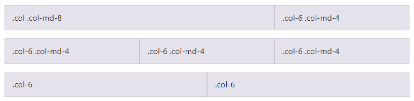
The class “col-6” added to the middle column makes it twice wide as the other two columns. Bootstrap handles grid columns as 12 equal blocks - 6 in our example means 50% of available space. The other two columns will adjust to the remaining space, and they do that equally - 25% each.
Bootstrap responsive Grids
Bootstrap Grids also supports responsive design, as described in Responsive Classes. We are taking advantage of these classes in our implementation, so content editors will be able to build responsive grid sets directly in Experience Editor.
How the implementation works
Not surprisingly, Content Editors will have some renderings to add to their placeholders. When added to a page, these renderings will offer a basic markup with additional placeholders at respective columns, where your actual components will be added. Multiple renderings can be nested to create complex page layouts, and everything can be responsive (or not).
There are two basic types of components we are going to implement:
Bootstrap Container
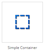
A single rendering, injecting a basic Bootstrap <div class=”container”>
<div class="container">
    {placeholder}
</div>
Bootstrap Row/Columns Containers
Multiple renderings, each of them injecting a different markup, according to the specific purpose. A Single Column Container, for instance, will render something like:
<div class="row">
    <div class="col">{placeholder}</div>
</div>
As you may guess, a “Simple Container” is supposed to be used as the parent rendering of one or more Column Containers, but nothing will stop you from breaking this rule if you want to take advantage of this grid system outside of the Bootstrap Grid scenarios.
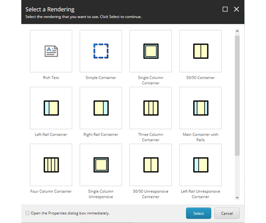
Working in Experience Editor
Editors will simply add a rendering to a placeholder, it is rendered and new placeholders will appear. Make sure to adjust Allowed Controls properly, so you have all controls you need at your placeholders. Our sample solution (link here) comes with some pre-defined placeholders, but you can easily change and expand it according to your needs.
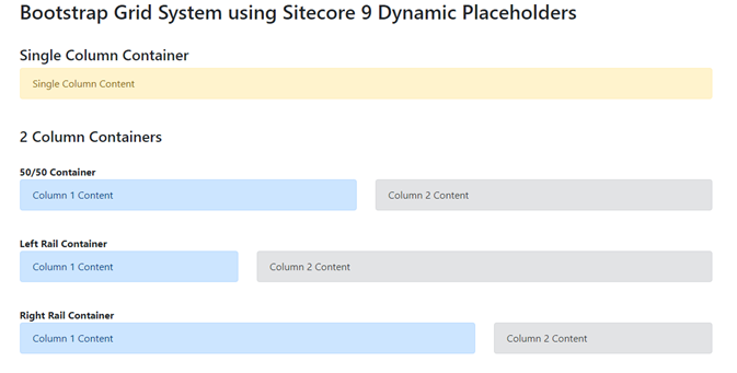
By using the Grid System Editors can visually create grids like these:
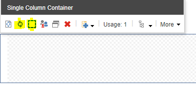
- Replace component – Enables editors to replace this rendering by another type. A Single Column can become a two column, a 50/50 Column can become a 25/75 Column, etc.
- Edit grid properties – By default, each rendering comes with their appropriate classes selected. This dialog enables editors to change that by changing the classes used at the rows and columns. They can also choose to hide the row div entirely – it will obviously break Bootstrap but again, sometimes you have to break the rules.
Css Class Injection
Our solution comes with a set of predefined classes, enough for us to implement the whole Grid System, but you can easily add your custom classes by adding new items to these folders. You can find the root item at /sitecore/system/Modules/Grids.
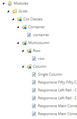
The only field the Css Items have is the Css Class field, and we use Name and Display Name to offer a more meaningful description to content authors.
This implementation is really basic and somehow limited, but you can think on ways to make it more fun. With some custom code you could have, for instance, some Site-Level classes that will only be available at your specific site (Hint: use the getLookupSourceItems pipeline to implement your logic for custom Field sources).
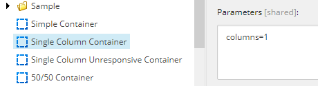
These classes are available for editors due to custom Parameter Templates that we created under /sitecore/templates/User Defined/Grids/Parameters. Take for instance the _Simple Container Parameters template, used at the Simple Container:
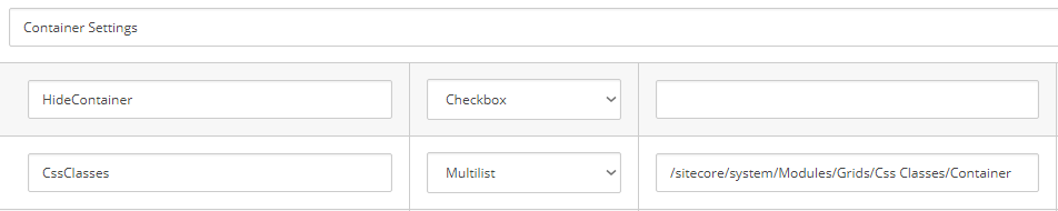
Beside the checkbox to hide the whole container, we also have a Multilist field with its source pointing to one of our CSS roots, which will populate the dialog accordingly.
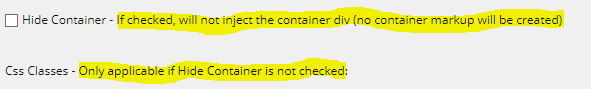
Important: Sitecore does not support Rendering Parameters with spaces, so we are naming fields without spaces, then adjusting both their Display Name and Title fields so it looks good for the users. We are also setting up help texts so they are self-explanatory:
These Parameter Templates are then referred at our renderings (found under /sitecore/layout/Renderings/Grids). Back to the Simple Container example, this is how this rendering is setup:
The Renderings
So here is a complete list of the available renderings:
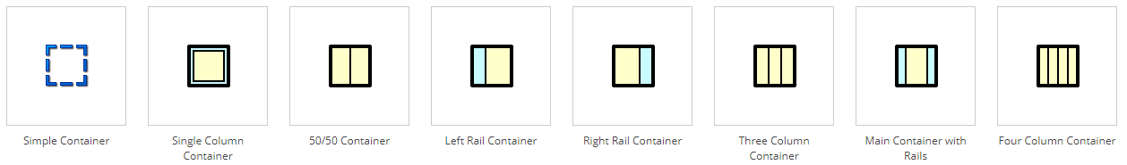
Except for Simple Container, all the rest have their “Responsive” and “Unresponsive” versions the editor can switch by using “Replace Component”, as previously explained in this article.
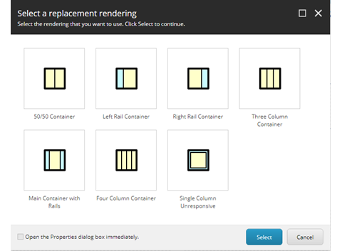
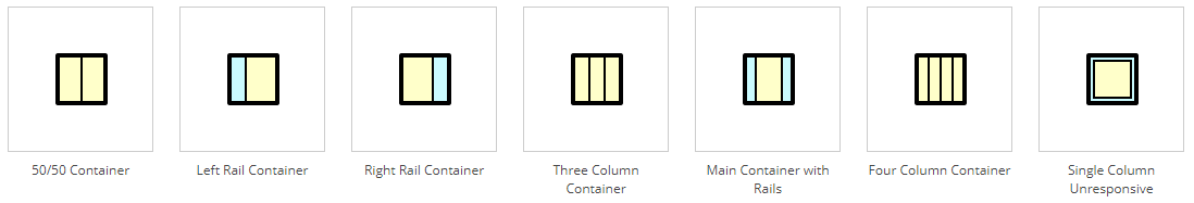
When you try to replace a rendering, you will notice the current mode is respected. A Single Column Container (responsive) can be replaced by other variations of “Responsive” Containers, and also to the Single Column Unresponsive, its own “Unresponsive” version:
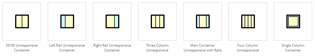
If we switch this grid to its Unresponsive version, variations of the Unresponsive Containers are available for replacement along with its Responsive version, enabling the editor to switch it back.
Down to the implementation…
Now that you know how the grid system works, let’s deeper dive into the implementation itself. We will start from the easier Simple Container:
Simple Container – Rendering
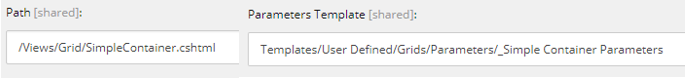
We already covered this one. Stored at /sitecore/layout/Renderings/Grids/Simple Container this rendering has:
- Path: /Views/Grid/SimpleContainer.cshtml
- Parameters Template: _Simple Container Parameters – already covered at this article, contains the fields “Hide Container” and “Css Classes”, along with the default class “container” at the _Standard Values.
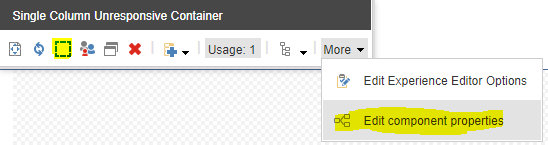
- Experience Editor Buttons: Our custom “Properties” button – located at core:/sitecore/content/Applications/WebEdit/Custom Experience Buttons/Grid/Properties, this is a clone of the native /WebEdit/Default Rendering Buttons/Properties, which is hard to find as its hidden down at the More dropdown. We added a better positioned button for the grids for a better edition experience.
Simple Container – View
This view is at \Views\Grid\SimpleContainer.cshtml – you can see the whole code here (link here), but the most important parts are:
The placeholder
@Html.Sitecore().DynamicPlaceholder("gridcontainer", CreateWrapper)
- “gridcontainer” is the placeholder name
- “CreateWrapper” is the method used to build the markup of our placeholder
And the CreateWrapper method:
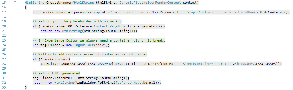
Let’s break this into details:
- Line 15 – Our method will be called for each of the placeholders to be rendered. Simple Container renders a single placeholder, but for the Row and Grids Containers this will happen multiple times;
- Line 17 – Gets the value of the “HideContainer” property. We have created a provider class (ParameterTemplatesProvider) to implement the logic of getting a parameter value. The following methods are available at this provider:
- string GetParameter(DynamicPlaceholderRenderContext context, string parameter)
T GetParameter<T>(DynamicPlaceholderRenderContext context, string parameter)- Returns raw string or strong-typed cast value of a given parameter
- Will first look at the placeholder-specific parameter, then the rendering parameter.
- This means you can pass parameters to specific placeholders, or to all placeholders – will be extremely useful when we implement our Row and Columns Containers, as we now can pass different parameters to each placeholder dynamically generated.
- string GetParameter(RenderingItem rendering, string parameter)
T GetParameter<T>(RenderingItem rendering, string parameter)- Returns raw string or strong-typed cast value of a given parameter
- Will always look in a RenderingItem (no fallback) – This is how we read Rendering Parameters setup directly at the Rendering Item itself in Content Editor. In our implementation, we are using these overloads only at the Multicolumn.cshtml view, which we’ll elaborate further in this article.
- string GetParameter(DynamicPlaceholderRenderContext context, string parameter)
- Lines 20-21 – We are returning the placeholder as-is (without container div) if the editor setup the HideContainer option. The Experience Editor can break if there’s no container (it also don’t like when you break the rules) so we are going ahead and adding the outer div while in Experience Editor;
- Lines 24-28 – Creating and adding classes (when needed) to the container div;
- At line 28 we are using the method GetInlineCssClasses from CssClassRepository to do the work of transforming the CSS items, selected at the CssClasses parameter, into a string of concatenated classes;
- At line 28 we are using the method GetInlineCssClasses from CssClassRepository to do the work of transforming the CSS items, selected at the CssClasses parameter, into a string of concatenated classes;
- Line 31-32 – This is where we add our placeholder, passed to our method as the htmlString parameter, inside our recently created container DIV.
We also need to declare our two providers as private variables we can use:
private readonly ICssClassProvider _cssClassProvider = new CssClassRepository();
private readonly IParameterTemplatesProvider _parameterTemplatesService = new ParameterTemplatesProvider();
We now have a fully functional Simple Container rendering, injecting Css Classes and showing/hiding the wrapper div as the content editor configures.
Multicolumn Containers – View
The rest of implementation will be covered by the view \Views\Grid\Multicolumn.cshtml. The components we have left to build will simply inject a <div class=”row”> (or hide it according to configurations) with one or multiple <div class=”col”> inside. Again, all classes can be customized as well.
We open our view with some code to retrieve the number or columns to create:
// Number of Columns
var parameterTemplatesProvider = new ParameterTemplatesProvider();
var columns = parameterTemplatesProvider.GetParameter<int>(RenderingContext.Current.Rendering.RenderingItem, "columns");
if (columns == 0)
{
    columns = 2;
}
Once again, we are using our ParameterTemplatesProvider to get a parameter value, but this time we are using the current RenderingItem. This way we can specify a number of columns to render directly at the Rendering Item, at the Parameters field:
Next, we drop our Dynamic Placeholder:
@Html.Sitecore().DynamicPlaceholder("gridcolumn", CreateWrapper, columns)
- “gridcolumn” is the placeholder name
- “CreateWrapper” is the method used to build the markup of our placeholder
- “columns” is the number of columns we just retrieved from parameters
And the CreateWrapper method:
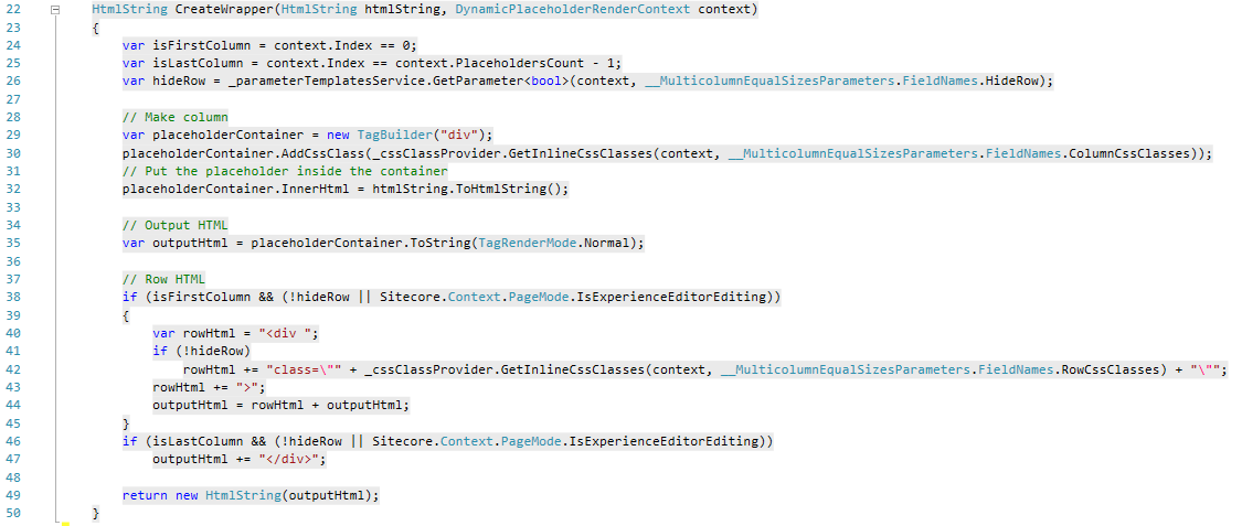
Beside the things we covered at the first view, let’s check what we get:
- Lines 24-25 – Some boolean variables are declared so we can check if this is the first and/or last columns. Remember we are in a loop now, so we need to handle things accordingly;
- Lines 29-35 – A div for our column is created, respective classes and the placeholder are added, then it goes to the outputHtml string variable we are returning later;
- Lines 38-44 – If we are at the first column of the loop, the outer <div class=”row”> is added to the beginning of the outputHtml. We are also taking care of hiding/showing that accordingly;
- Lines 46-47 - If we are at the last column, the closer </div> tag is added to the end of the outputHtml.
Yes, this is all we need to support one to infinite columns! From now on we can progress without coding, so let me bring the specifics of each rendering.
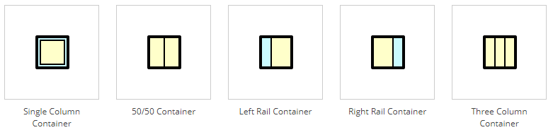
50/50 Container
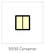
Rendering item is located at /sitecore/layout/Renderings/Grids/Fifty Fifty Container and it has:
- Path: /Views/Grid/Multicolumn.cshtml (all other renderings will have this)
- Parameters: columns=2 (two columns)
- Parameters Template: _Fifty Fifty Parameters
- Experience Editor Buttons: Our custom “Properties” button
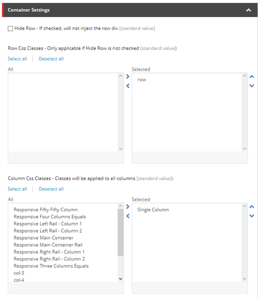
The parameters template we are using is inherits from _Multicolumn Equal Sizes Parameters the following fields:
- HideRow – Checkbox – If checked will not inject a <div class=”row”>
- RowCssClasses – Multilist – Classes used at the row. Source points to /sitecore/system/Modules/Grids/Css Classes/Multicolumn/Row
- ColumnCssClasses – Multilist - Classes used at the columns. Since our 50/50 has equal column sizes, we can inject same classes to all columns. Source to points to /sitecore/system/Modules/Grids/Css Classes/Multicolumn/Column
_Standard Values of our _Fifty Fifty Parameters template will also have some predefined classes for Row and Columns. This is how we make our rendering comes pre-populated and looking as it should by default:
- Row - “row”
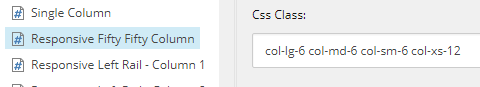
- Columns - “Responsive Fifty Fifty Column” renders “col-lg-6 col-md-6 col-sm-6 col-xs-12”
The 50/50 Unresponsive Container variation is even simpler, it uses _Multicolumn Equal Sizes Parameters directly, and inject the standard “col” class in all columns.
Left Rail and Right Rail Containers
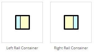
These are also 2 columns containers, but now we need to inject different classes in the left and right columns. We have two renderings, Left Rail Container and Right Rail Container, each one pointing to their respective parameter templates “_Left Rail Parameters” and “_Right Rail Parameters”. These two inherits from _Two Columns Parameters the following fields:
- HideRow – Checkbox – If checked will not inject a <div class=”row”>
- RowCssClasses – Multilist – Classes used at the row. Source points to /sitecore/system/Modules/Grids/Css Classes/Multicolumn/Row
- ph_gridcolumn_0_ColumnCssClasses – Multilist – Classes used at the first column. Source points to /sitecore/system/Modules/Grids/Css Classes/Multicolumn/Column
- Sitecore uses the following syntax, separated by underscores:
- “ph” - Means this is parameter is passed to a specific placeholder
- “gridcolumn” – Our placeholder name
- “0” – Means this parameter is just for the first column
- “ColumnCssClasses” – Parameter name
- This means that whatever value is setup at this field, will be passed to the first column of the gridcolumn placeholder as the ColumnCssClasses parameter.
- Sitecore uses the following syntax, separated by underscores:
- ph_gridcolumn_1_ColumnCssClasses – Same as previous but for the second column.
_Standard Values of our _Left Rail Parameters template has:
- Row - “row”
- Column 1 - “Responsive Left Rail – Column 1” renders “col-lg-4 col-md-4 col-sm-4 col-xs-12”
- Column 2 - “Responsive Left Rail – Column 2” renders “col-lg-8 col-md-8 col-sm-8 col-xs-12”
_Right Rail Parameter’s _Standard Values has Columns 1 and 2 with inverse values as _Left Rail Parameters.
Their respective Unresponsive variations makes use of two specific Parameter Templates, _Left Rail Unresponsive Parameters and _Right Rail Unresponsive Parameters. At each of the two columns, they use the unresponsive classes “col-4” (33.3%) and “col-8” (66.6%) to setup their widths.
Remaining Renderings will follow the same pattern, so we will just present them briefly and later provide a full grid with all Renderings and their specific setups.
Three Columns and Main Container with Rails
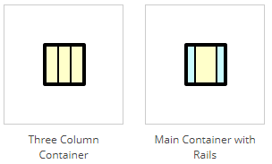
Both renderings have 3 columns, however the first has 3 equal columns and the second has a bigger column at the middle.
Four Columns
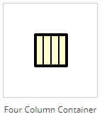
This rendering will bring 4 equally sized columns
Renderings Matrix
Here is a full list of our Renderings and their setups:
|
Rendering |
# of Cols |
View |
Parameters |
CSS Col 1 |
CSS Col 2 |
CSS Col 3 |
CSS Col 4 |
|
Simple Container |
1 |
SimpleContainer.cshtml |
_Simple Container Parameters |
container |
|
|
|
|
Single Column Container |
1 |
Multicolumn.cshtml |
_Single Column Parameters |
col |
|
|
|
|
Single Column Unresponsive Container |
1 |
Multicolumn.cshtml |
_Single Column Parameters |
col |
|
|
|
|
Fifty Fifty Container |
2 |
Multicolumn.cshtml |
_Fifty Fifty Parameters |
col-lg-6 col-md-6 col-sm-6 col-xs-12 |
col-lg-6 col-md-6 col-sm-6 col-xs-12 |
|
|
|
Fifty Fifty Unresponsive Container |
2 |
Multicolumn.cshtml |
_Multicolumn Equal Sizes Parameters |
col |
|
|
|
|
Left Rail Container |
2 |
Multicolumn.cshtml |
_Left Rail Parameters |
col-lg-4 col-md-4 col-sm-4 col-xs-12 |
col-lg-8 col-md-8 col-sm-8 col-xs-12 |
|
|
|
Left Rail Unresponsive Container |
2 |
Multicolumn.cshtml |
_Left Rail Unresponsive Parameters |
col-4 |
col-8 |
|
|
|
Right Rail Container |
2 |
Multicolumn.cshtml |
_Right Rail Parameters |
col-lg-8 col-md-8 col-sm-8 col-xs-12 |
col-lg-4 col-md-4 col-sm-4 col-xs-12 |
|
|
|
Right Rail Unresponsive Container |
2 |
Multicolumn.cshtml |
_Right Rail Unresponsive Parameters |
col-8 |
col-4 |
|
|
|
Three Column Container |
3 |
Multicolumn.cshtml |
_Three Equal Columns Parameters |
col-lg-4 col-md-4 col-sm-12 col-xs-12 |
col-lg-4 col-md-4 col-sm-12 col-xs-12 |
col-lg-4 col-md-4 col-sm-12 col-xs-12 |
|
|
Three Column Unresponsive Container |
3 |
Multicolumn.cshtml |
_Multicolumn Equal Sizes Parameters |
col |
col |
col |
|
|
Main Container with Rails |
3 |
Multicolumn.cshtml |
_Main with Rails Parameters |
col-lg-3 col-md-3 col-sm-3 col-xs-12 |
col-lg-6 col-md-6 col-sm-6 col-xs-12 |
col-lg-3 col-md-3 col-sm-3 col-xs-12 |
|
|
Main Container Unresponsive with Rails |
3 |
Multicolumn.cshtml |
_Main with Rails Unresponsive Parameters |
col-3 |
col-6 |
col-3 |
|
|
Four Column Container |
4 |
Multicolumn.cshtml |
_Four Equal Columns Parameters |
col-lg-3 col-md-3 col-sm-6 col-xs-12 |
col-lg-3 col-md-3 col-sm-6 col-xs-12 |
col-lg-3 col-md-3 col-sm-6 col-xs-12 |
col-lg-3 col-md-3 col-sm-6 col-xs-12 |
|
Four Column Unresponsive Container |
4 |
Multicolumn.cshtml |
_Multicolumn Equal Sizes Parameters |
col |
col |
col |
col |
Creating rendering variations of all kinds is now just a matter of creativity and will not take more than creating a new Rendering and, in some cases, its respective Parameters Template.
Source Code
You can have access to the source code at Nishtech’s Git Repository:
https://bitbucket.org/nishtechinc/dynamicplaceholdergrids
Feel free to download and contribute as much as you want. We are glad to see your pull requests coming!