The Nuptial SXA Experiment - Part 3 (Milestones 2 and 3)

Milestone 2 - Groom and Bride Page
The second milestone will set the basis for the Groom and Bride Page, the one and only internal page covered at this exercise.
Similarly to the previous milestone, we are also only working with static blocks instead of dynamic components. We will, of course, take advantage of the structure established at the first milestone to implement this page quicker.
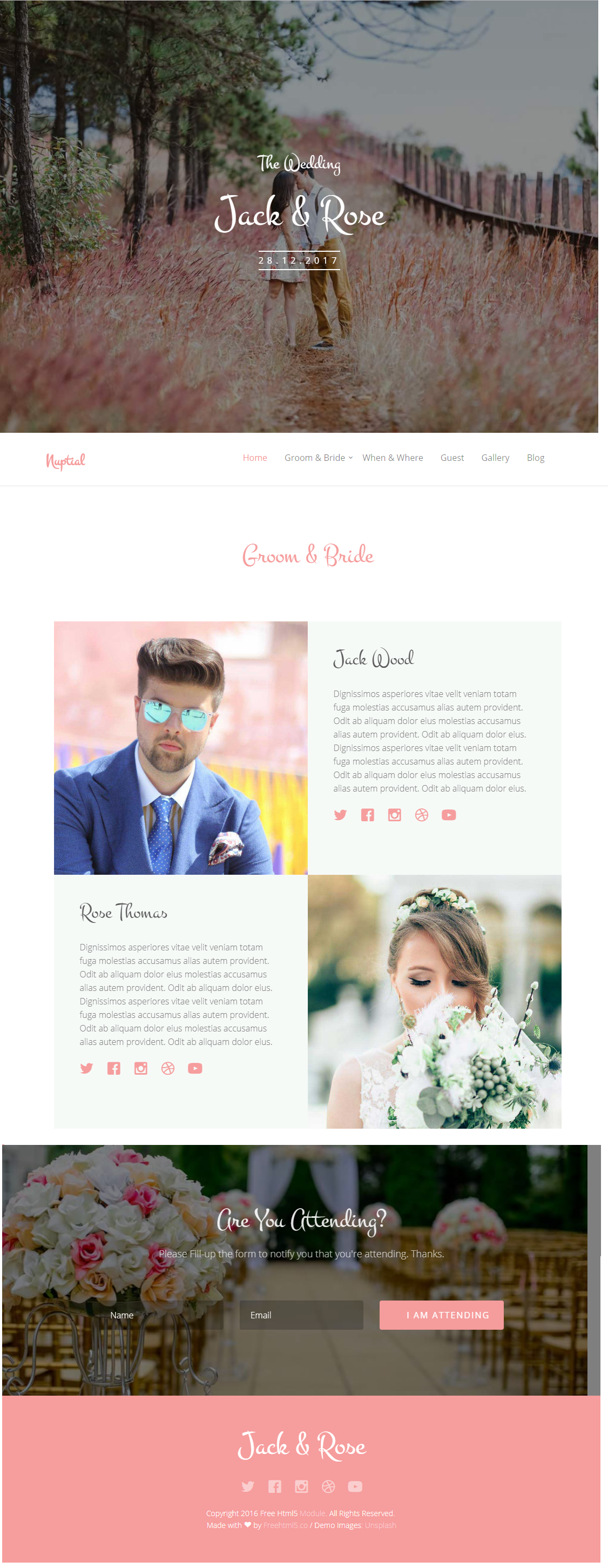
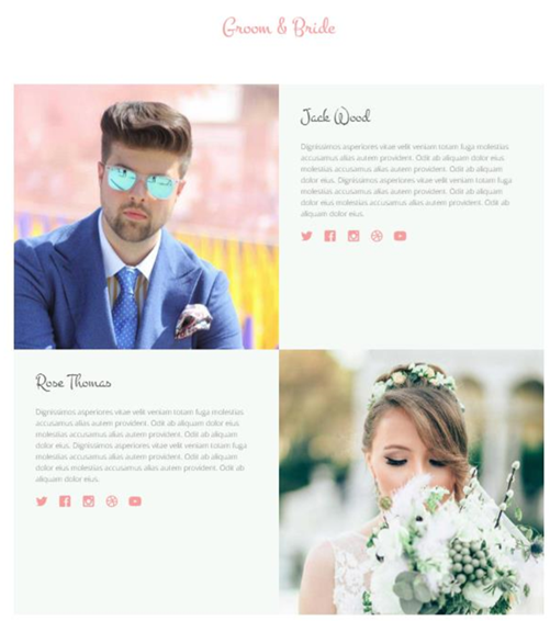
Here is a screenshot of the Groom and Bride page (click to enlarge)
Now that we have a good base structure in place, this part will be pretty simple and straight-forward.
- We start by changing the layout of the Page Template to use our Layout:
/sitecore/templates/Project/NishTech/Page/__Standard Values
Remember: “You’re not supposed to do this way”
- Let's go ahead and create a new page item, underneath Home, called "Groom and Bride";
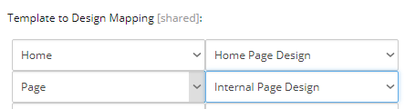
- In order to re-use our Partial Designs, we need to create a new Page Design called "Internal Page Design".
When it is done, we have to further add our existent Header and Footer Partial Designs.
- At the Site Page Designs, we need to match our Page template with our new Page Design:
- Using static HTML blocks, we are going to add the remaining components to the page:
- Hero Banner - with a slightly different content than the Homepage
- Groom & Bride block - Later to be implemented as a dynamic component
Looking for basic SXA documentation?
The steps above are all about basic SXA implementation, which this article is not concerned to further explain.
If you are looking for fundamental information, there are multiple good resources out there, including but not limited to:
- Some of the Official SXA Documentation
- Sitecore Usergroup Videos
- “An introduction to working with Sitecore Experience Accelerator (SXA)” - Vladimir Zaverugo (SUG Belarus)
- "Sitecore Experience Accelerator (SXA) In Action" - Pratik Satikunvar (SUG India)
Milestone 3 - Dynamic components
During the third and last milestone, we will finally create some dynamic components. With a richer Content Editor Experience, these dynamic components will replace some of the static HTML blocks we are using so far.
A very important highlight while building our dynamic components: we tried to stick with the recommendations from this article at the Official Documentation (Walkthrough: building a new rendering)
"Note: To be able to use the Creative Exchange functionality in SXA, you must use the Html.Sxa().Component()
This helper injects data attributes for a Creative Exchange export."
Here is one example of a simple, acceptable component view file:
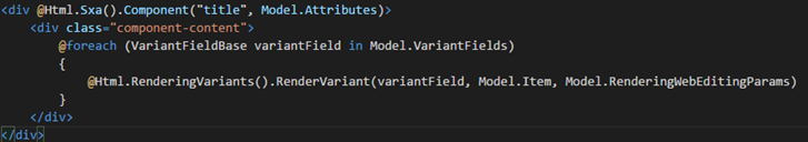
Comparing with the markup from Nuptial looks like we indeed can inject the Html.Sxa().Component() at the outer DIV.
But will the fancy markup inside be a problem for Creative Exchange? For instance, we don't have a single DIV inside, but multiple DIVs. One of these DIVs are empty, will that be an issue? Due to the nature of this experiment (not using this feature), the question stays open.
However, if you aim to use Creative Exchange with your new component, make sure to follow all recommendations, test your Creative Exchange process and make adjustments where needed.
Component 1 - Hero Banner

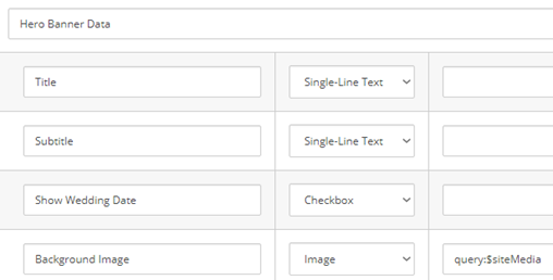
This component is meant to be used at the top of several pages. A very simple Hero Banner with a responsive background image and some extra text in the middle. Most of the information is stored in the Datasource Item: Title and Subtitle, the background image, whether or not to show the Wedding Date. The Wedding Date itself is the only piece of data being stored Globally: this value needs to be configured once and used in different components.
<div class="fh5co-hero" data-section="home">
    <div class="fh5co-overlay"></div>
    <div class="fh5co-cover text-center" data-stellar-background-ratio="0.5" style="background-image: url(images/cover_bg_1.jpg);">
        <div class="display-t">
            <div class="display-tc">
                <div class="container">
                    <div class="col-md-10 col-md-offset-1">
                        <div class="animate-box">
                            <h1>The Wedding</h1>
                            <h2>Jack & Rose</h2>
                            <p><span>28.12.2017</span></p>
                        </div>
                    </div>
                </div>
            </div>
        </div>
    </div>
</div>
Implementing this component was very close to the traditional Sitecore development. Here go the steps followed during the execution of this task:
- Created a template for the global Wedding Date setting - our repository for Global Configurations.
- Created a Model matching our new template, so we can code in high level. In our case, we are using Sitecore Rocks Code Generation templates due to simplicity. It generates all constants for fields and template IDs, providing a simple but nice wrapper you can dress your item and work strong-typed
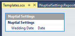
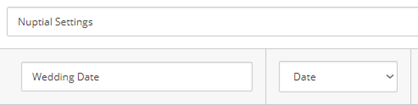
- Inserted a new item for the global settings under /sitecore/content/NishTech/Nuptial/Settings/Nuptial Settings
- Created a Datasource Template and its respective Model
- Created a rendering at /sitecore/layout/Renderings/Feature/Page Content/Hero Banner, along with its respective Controller Action and View;
- Registered the new dependencies for Dependency Injection
- And finally, we replaced the plain HTML block with our new dynamic component
Component 2 - Couple

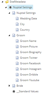
Intended to quickly present the couple, their names, pictures, wedding details. The only information stored at the Datasource Item, this time is the component title ("Are Getting Married"). All the rest will come from a Global Setting: the groom & bride information (names, pictures, biographies and social media links) has to be managed globally. Wedding date, city, and country are also managed globally. I know the biography and social media links are not present at this component, but they will soon be used at the Goom & Bride component we are going to build next, so let's create it all sooner than later.
And the execution steps goes like this:
- Extended the template for global Wedding Date setting, adding new fields to manage all the information we are going to use.
- Update our Model to have the new fields;
- Created a Datasource Template under /sitecore/templates/Feature/Page Content/Couple along with the respective model;
- Created a rendering for the component at /sitecore/layout/Renderings/Feature/Page Content/Couple and their Controller and View;
- Registered the new dependencies for DI;
- Last but not least, we replaced the plain HTML block with our new dynamic component.
Further issues...
After the component was ready to test, one small layout issue happened with wrong margins. Again, one of the SXA CSS classes was conflicting with our style. Fortunately, it was a quick fix to the style.css file, adding the tag !important to the margin definition of the following class:
#fh5co-couple img {
    margin-bottom: 20px !important;
Component 3 - Footer

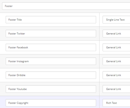
The page Footer is also handled as a component which, being part of a Partial Design, will be injected in every single page. Everything in this component is managed at Datasource Item level, enabling it to be tested and personalized. It has a title, a copyright text, social media links, and some fancy HTML. For this step of our journey, here go the golden steps:
- Created Datasource Template at the path /sitecore/templates/Feature/Page Content/Footer and its Model Class;
- Create a rendering to our component at /sitecore/layout/Renderings/Feature/Page Content/Footer;
- Created Controller + View
- Register new dependencies
- Replaced plain HTML block with our new component
Further issues...
Everything was cool, except for one detail: The social media icons are not looking good, they are smaller and closer than they should be, and have no links.

We are using Sitecore's General Links field renderer to render these images like this:
@Html.Sitecore().BeginField(Footer.FieldIds.FooterTwitter.ToString(), Model.Footer.InnerItem)
    <i class="icon-twitter2"></i>
@Html.Sitecore().EndField()
In bold is what makes the Twitter image appear, but our CSS also expects a surrounding anchor link to make it look properly.
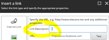
When editing these links, we need to make sure the "Link Description" has some content. If we leave this field empty, Sitecore will not render the anchor tag and killing our design.
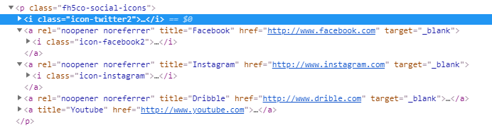
Given that in our case we need the link description to be empty, let's add a space to satisfy the field renderer.
Component 4 - Groom and Bride
The last component in our plate, this will consume lots of stuff we put together so far. It will read global data from our Nuptial Settings item. It will also reuse the same Datasource Template and the same Controller Action from the Couple component. It is really just a rearrange of existent data in a different look and feel. So our step list is now leaner:
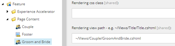
- Create the rendering at /sitecore/layout/Renderings/Feature/Page Content/Groom and Bride;
- Setup /sitecore/templates/Feature/Page Content/Couple as Datasource Template;
- Make it use the same Controller and Action as the Couple rendering, but pointing to a different View:
- Replace the plain HTML block with our new component
And this closes the third and last milestone, as well as the Nuptial Implementation. In the final article, we will revisit the experiment outputs and present our conclusions.